Final – Dragazine

Reflecting on the context going on around in this time period, I kept my attention on The New York Club Kids subculture, which this zine is dedicated to.

Party Monster, Ru Paul’s Drag Race, Paris Is Burning, Nan Goldin and Voguing are sources of documentation that have introduced me to a type of alternative to reality; everything is beautiful, noisy and fierce with no room for subtlety.

Through my projects I have learnt about The Blitz Kids – a group of young people who frequented the weekly Blitz club-night in Covent Garden, London in 1979-80. This may of led to inspire The Club Kids in New York City in the late 1980s and early 1990s. The group was notable for their elaborate and outrageous costumes; which blured the social conventions of gender and identity.

This series presented as a body of work communicates a fashion based ethos.


chanel 2

For the front cover of my zine I wanted to carry on using collages inspired from the work of John Stezaker. I cut out found images from magazines to work as the outfit. This was then scanned onto the computer to work as the cover for Dragazine.

1

To create the zine I used the program Book Wright for editing and then uploaded the finished project to Blurb.

3

There were many different page layouts that could be used, I made sure I was using a variety of them and not repeating myself too much.

2

– After completing my first draft of the book I then saw areas of improvement (such as changing the positioning of text and changing picture sizes).

4

All together Dragazine is 24 pages long /soft cover and is in the process of being printed for my final coursework outcome.

Absurdity: Fashion

I decided to look at  Fashion in all of its broadness, specifically documenting with a type of snap shot aesthetic; staged but convincingly ‘grabbed’. I felt that my previous images (first/original photo-shoot) lacked a specific motive as it was very broad, it was more of a spontaneous photo-shoot.  As opposed to my second photo-shoot, where I carefully thought about different shooting locations; thinking about the context going on around in this time period.

Expanding from my original photo-shoot I kept my attention on The New York Club Kids subculture.Through my research I even found The Blitz Kids – a group of young people who frequented the weekly Blitz club-night in Covent Garden, London in 1979-80.
This may of led to inspire The Club Kids in New York City in the late 1980s and early 1990s. The group was notable for their elaborate and outrageous costumes.

http://www.harpersbazaar.com/culture/features/a978/stephen-jones-london-club-scene-0613/
“You were supposed to wear something really original. Designer clothes would’ve been the kiss of death…All the straight boys wore makeup, like blue lipstick and eyeliner…The club was on a Tuesday night, and on Sunday you started planning your outfit. It wasn’t just fashion—you really believed it.” – Stephen Jones, New Romanticism.

I decided to go to an underground subway at night as I felt this was a connection to how The Club Kids and The Blitz Kids would have most likely got to the clubs; by walking or getting the tube (given their locations in New York and London, where cars won’t get you anywhere fast).
I felt that the underground subway worked well in terms of context, as this type of ‘New Romantic’ style would have been very “underground” before it got popular in the late 70’s/ early 80’s. This supports these images beneath, which only work as a set of 4; there is a build up to the model, working as a puzzle. I experimented with the idea of concealing the identity of this person/model. However, there are suggestions of insight about this character, by using bright colors such as the green wig and a contrasting pink. This shows the importance of fashion for this type of New Romantic style.

These next few shots for me worked out the best due to the peculiarity and absurd quality about them. The way I have layered this set of images out, works well with the theme absurdity, as each of the photos individually participate in adding to the story. The gestures implied using bananas also adds a humorous quality about them. Generated through a snapshot aesthetic.

banana
141
kkyayayyaya copy

Here are more images from the photo-shoot.

Studio Portrait Work

Based on further experimentation in a studio keeping to my ‘New York – Club Kid’ theme

I feel these two images have good connections to my theme; the slow shutter speed causing the distortion of the set creates a good concept of the voguing/ dancing scene – linking into Drag. The distortion of identity is key here as it blurs the lines between gender.

beth
After exploring my theme through a documentary style of photography I wanted to try a new approach that was more staged; a studio work shooting. This was a controlled shoot as I was detecting the model as apposed to capturing a performance/ or documenting a real life person. The studio shoot has a quiet feel about it, as their are no distractions in the foreground with a black drop-down.DSC_1954 copy


Absurdity: Subcultures

Expanding from my mannequin documentary work, I noticed exaggerated similarities; connecting the mannequins to real life people such as: The New York club kids and female impersonators – who both amplify their appearance through tools such as: fashion and make-up.
This correlates to my own work as I have been inspired by: Party Monster, Ru Paul’s Drag Race, Paris Is Burning, Nan Goldin and Voguing. These sources of documentation about the subculture’s have introduced me to a type of alternative to reality; everything is beautiful, noisy and fierce with no room for subtlety.

paris is burning“Paris Is Burning”

I don’t find the idea of exploring gender identity/ sexuality absurd, what strikes me as interesting is the eccentric flamboyant, theatrical, caricature nature of the ‘drag’ subculture scene as an example of human behavior and humor in some cases.
DSC_1724 copy
DSC_1720DSC_1725 copy

These are a couple of experiments that did not work out too well, however I think they show how color can be effective – to draw out more of a narrative and give a sense of time and place.  

The use of extreme hair and make up in these experiments shows how the use of color, texture and attitude of the subject/model portrays self image.This could be a connection to previous generations; like the Club Kids – who endeavored to stand out from the crowd and make the most from their individuality as opposed to the modern ‘Selfie’ era and peoples obsession to present themselves as perfect.

I found that the images which worked best from this photo-shoot, were the ones with a sense of movement; it added more character, with a documentary type of feel to them.
DSC_1741 DSC_1742 DSC_1743

With these experiments I feel like there is a very organic quality about them, as I recreated the essence of exploration of image in my own bedroom, with my sister and our crazy wardrobe. Therefore I finally reached an understanding of what the people from other youth cultures went through in order to create their iconic “look”, be it Punk, Goth, New Romantic or Drag. They had the courage to experiment, be absurd and stand out.

Absurdity: Shop Mannequins

Developing on from my Absurdity theme, I documented things that were out of place in the environment they were in. I found a collection of Mannequins in a old vintage store when searching for Absurd items to document. The Mannequins I found seemed to be stuck in the 60’s, their exaggerated poses and make up was far away from reality on a day to day basis, therefore they take on a surreal quality when out of context (in a flee market).

DSC_1440 DSC_1424 DSC_1431 DSC_1428

Absurdity: Documenting An Area

Untitled Images

These 6 images where taken when I went out to a Christmas event in Dorset, They do not fit into the Christmas documentary series visually which I previously focused on, but they link into the social documentary aspect of Christmas; leading me back to the work of Martin Parr with the way humans behave whether that’s curious or humorous to viewers.

1. The first images composition sets up a strong tension; the women’s finger is perfectly on the edge of the images boarder; pointing away, whilst another persons arm coming in from the left is drawing attention to the center. The space on the right balances out the image enough to allow it to breath.

2. Both images one and two have the same humorous quality about them, I found the simplicity of a stall owner wearing the same thing their selling; accident or not, funny.

colour DSC_1315

3. This lime green coat was the most striking piece of clothing I could see in the Market, its intense dominant color and texture draws the viewers eyes towards it, especially when it clashes against other colors such as the orange in the back (green and orange are on opposite sides to each other on the color wheel). The coat itself also helps unmask the person wearing it, the coat is an insight to this persons personality.

coat

 supporting imagery

ladies saturatedwatchingDSC_1287

Christmas means red.. lots and lots of red

I couldn’t think of a better time to focus on social documentary rather than at Christmas; the king of all holidays. Leading up to Christmas gave me millions of opportunities to get me out documenting my broad theme ‘Christmas’ and the absurd nature of it. I put my attention on the traces of Christmas such as: food, decorations and clothing (especially anything of the traditional Christmas colors – Red, White, Green and Gold).

I chose these five images for my Christmas field study as they are the strongest, each one individually represents Christmas in its own way; this makes them as a series even stronger.

santa 111 tree hatimageedit_4_9043604906
DSC_1337

Absurdity: Documentary – Human Behavior

Documentary photography certainly has an absurd aspect to it, as it is something commonly associated with a snap shot documentation (unplanned recordings) and is scene through social documentary, photo journalism, repotage, street photography and war photography (these are all unpredictable in how they can be documented).
When analyzing the main objectives in documentary photography it is important to take into consideration the contextual meaning to an image adding value to the events happening in that era: historical, personal, visual and cultural contexts and conceptual, highlighting the: idea, meaning, reasoning, thought, notion, concept / essence of the work itself.

Richard Billingham

richard

English photographer Richard Billingham (known best for his book photo-book ‘Ray’s A Laugh’, which documents his home-life; living with his alcoholic father Ray and heavily obese mother Liz) shows the connections Billingham makes himself in his home life documenting with his intensely saturated disposable cameras.
There is a tone of humor in the image above of Billingham’s mother. The combination of his mothers dress and puzzle pieces give the image a textual quality; quick visual connections from the color similarities, giving it a snap shot aesthetic feel.

The snapshot aesthetic and social documentary of the photographers home-life, reminds me of the work of Martin Parr.


 Another British documentary photographer Martin Parr, known for his intimate projects  looking at anthropological aspects of modern life, especially in England. Martin Parr connects to Richard Billingham with his documentation of the demographic class in society. They are both quiet observers that look at human behavior (looking at social class in some of their work).

From exploring the different types of documentary genres I went out to Christchurch (Dorset) to begin my own documentary work. I noticed on my travels how peculiar it was to see the range of emotions from people feeding birds along the bay.
There is nothing humans gain from feeding birds, but people continuously interact with them and go out of their way to assure the animals get a bit of ‘Hovis bread’ now and again. It seems that humans are perfectly happy to forget what they have going on in their lives for a few minutes which I documented.
I thought this fitted in well with Richard Billingham and Martin Parr with their look and interest in social documentary of human behavior.

The Birds

cap birds improved copy

DSC_1199

DSC_1214

 Christmas Shopping?

After exploring documentary work I started my own objective field study; looking at ‘Christmas’ and the absurd behavior it promotes to people.
My chosen Field study focused on ‘Christmas Shoppers’. With Christmas vast approaching I thought it would be a good idea to document shoppers buying presents for friends and family in preparation for the holidays. It was interesting very plain and basic shopping bags peoples Christmas presents were placed in, due to the highly decorative shop windows that where promoting and luring buyers in; only to give them bags that did not have any connection to Christmas at all.

DSC_1174


Absurdity: Pinhole – Collages

Pinhole/Darkroom Work

IMG_9974

Pin hole boxes must be light tight as the photography paper is light sensitive so you can only get the paper out in a dark room with a safe light on. The photography paper must be put into the pinhole camera glass side up, with the paper opposite to the pinhole. Once all of this is done the pinhole box should be sealed with black tape.

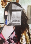
This is what the Pinhole images came out like originally. I uploaded them onto Photoshop to invert the images as the detail comes out much more clearly when you do this, helping to see the separate layers from the collage.

1

6

3

2

4

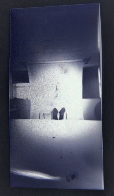
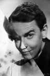
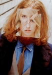
 My images touched on the idea of identity, this is why I used a camera and myself. Man Ray (Photographer: apart of the Dada and Surrealist movements) is an artist that connects well with these Pinhole experiments, known for his work with “Double Exposure”.

There is a sense of identity and curiosity with certain layers in his work, raising questions as to what they are. This is what happened in some of my images, with the camera overlay, along with the background studio lights, they are not perfectly clear, this gives them this ghostly and mysterious feel to them.

 From looking at artists like Hannah Hock, an artist that focuses on collages. I wanted to make my own collages again, but this time using a Pinhole camera – controlling the aperture and shutter speed, in order to overlay images on top of each other; by using repeat exposures, to create a collage effect.

For the image layers I used a camera as my object and myself as a model. I used the studio lights when taking the images (exposure for around 2 1/2 minutes each), the lights caused some of the pinhole images to be overexposed as the lighting was too bright, I also left the pinhole cameras hole exposed for too long in some cases – this happened the most when I left the camera exposed for about 3 minutes.

I then developed each of the images:
Developer for: 2 1/2 minutes
Stop bath: 30 seconds
Fixer: 1 minute
Rinse in water and place in rack to dry.

Photograms

From looking at how collages can be made by overlapping pictures when using a pinhole camera, I wanted to make my own photogram as there is a great prediction of what the collage will look like; as you are in control more of how it will look, unlike a pinhole camera image which is harder to know how the image will look.

With a photogram the sheet of light sensitive emulsion photography paper is blocked from light (in this case the light came from an enlarger – which provides an ideal of concentrated light source for the exposure of the photogram). Objects blocking the light from the paper create silhouette’s and shapes. The photograms showed a different side of collage work using light.

Artists/ photographers such as William Henry Fox Talbot (1800 – 1877) used the photogram/ shadowgram technique.

Arguably the surrealist Man Ray (1890 – 1976) made the technique popular by stumbling across the process by accident. Which caused him to experiment further and call them Rayographs. His Rayographs have a three – dimensional feel with various tones of grey as the 3D subject distorts the light.

I used various items I found in the art room which I thought looked visually interesting and curious. The objects that are more transparent such as the film images I used, which became black, unlike harder objects such as the rocks which came out white.
My photograms where influenced by the work of Man Ray due to the absurd shapes that cause questioning of the viewer to be curious of what the shapes are. This is different from William Henry Fox Talbot, who has more of a documentation feel to his experiences – nothing is being questioned as most of his images are very easy to figure out what they are.
These photograms had a difference development process: of about a 10 second light exposure time
Developer – 1fl – 9water (10) 1 minute
Stop bath – 1fl – 19 water – splash
Fixer – 1fl – 4 water – 15/20 seconds.

14

a

Developing film images

Now that I had experimented from pinhole work to photograms I wanted to expand my knowledge of making collages through darkroom style images.
I used the idea from the pinhole work and took a portrait of myself with a film camera.
1
Film

lighter
Enhancer – used for the light – exposure of film once placed in: 3 seconds

7

9

6

13

Once I developed some of the film images I wanted to use the photogram technique to overlap objects over the film, using paper for example to create different tones for the image.

12

I also used feathers when exposing the film onto the paper, however due to the photograms needing around 10 seconds of exposure and the film needing around 3 seconds of exposure it was hard to get both the object and the picture to develop probably.

11

15

Absurdity: Collages

In the year 1916 to 1922 the works from the DADA movement/era were extremely popular. The type of work involved adding onto original art pieces whether they were 2D or 3D pieces. The artwork created was a form of protest and expression, its concept focusing on ‘anti-art’ as they wanted to rebel against the idea of traditional art work. Artist such as: Hannah Hoch, John Stezaker and Marcel Duchamp are perfect examples of artist around this time; known for their popular DADA work.

Hannah Hoch is one of the artists I took particular interest in, due to her photo-montage type of work  consisting of two or more photos joined in someway. Hannah Hoch considered herself a part of the women’s movement in the 1920’s. Her pieces also commonly combine male and female traits into one unified being. Her androgynous collage characters may have also been related to her bisexuality and attraction to masculinity in women (the female form paired with stereotypically masculine characteristics); breaking down gender roles. Hoch was also critical of marriage, often depicting brides as mannequins and children, reflecting the socially pervasive idea of women as incomplete people with little control over their lives.


Inspired by the themes Hoch explores through her work I wanted to create a collage about how women are viewed in the media, using found images in magazines and newspapers.

women

My collage looked at the high mass media around women and what they wear. Newspaper articles I found focused on visual appearance of women.
Women’s clothing has constantly been an subject people have been debating and discussing throughout history. It is therefore relevant in this century and personally effects my generation, all contributing factors as to why I chose to make this collage. You cannot win no matter what you wear. I set the pictures out so they mimicked the outline of the well known ‘Ladies’ symbol/sign found on female toilet doors (even that famous symbol sets a sort of expected standard of clothing women are supposed to wear). I made the collage messy in certain parts when outlining the famous symbol to make the collage grotesque and displeasing.

John Stezaker

John Stezaker, known for his classic/ old images, starring famous movie stars and landscapes which are re-appropriated into a balanced collage in a fight for image dominance, with couplings of male and female images in black and white or a black and white image with a colored image layered on top of it (his collages consist of two photographs).

kiss

 These are the five collages I made inspired by John Stezaker.

Image 1. I used this idea of facial shape in order to find similar structured landscape photographs that hinted visually as to where the women was facing in the colored image.
Image 2. I explored female and male dominance in the collage as one of them is not black and white making it difficult to pick out which image works stronger or if they work together.
Image 3. This experiment did not conceal the women’s identity by another image on top of it. Instead I wanted to put a mountain landscape on her as this gave suggestions/hinted at the models hair.
Image 4. I went back to experimenting with collages visually with color leading the eye in this image. I used a black and white rock landscape again to hide away the models hair. I feel like this image did not turn out as well from the lack of original outline of the models hair; it stops the illusion from looking real.
Image 5. My final collage was split into three parts. I wanted to set up the composition which complemented the female and male similarities such as their facial shape. I think there is too much color in this collage which makes it hard to focus on one visual aspect clearly. This has helped me understand leading of the eye with color as I feel that Stezakers work looks visually better when one image is black and white and the other in color; it makes it clear what you should be taking from the artists conceptual intentions.

American Apparel/ American Appeal

88315474JK013_archive

“Feminism you know what I mean”
Putin joins Riot Grrrl

bikini kill

2014 Collages

cat calling

Studying Collages in the art world I looked at modern day collages of 2014. I came across the ‘Girls Against Cat-Calling 2014’ which I personally think fits in really well with the Collage theme, especially with DADA as the work is more about the contextual and conceptual side, the artists intentions. This collage undoubtedly would be controversial with certain people, this is the same effect DADA had in the art world. However, it got people to ask questions and take notice which I think this collage does.
Creator – Fwahgrah@gmail.com


Absurdity: Practical Responses Two

Carrying on from my first practical response I continued this idea of taking Absurd images with every day objects. My object was a ‘Cactus’, I wanted to continue with it as I thought it was visually interesting to look at due to its color and texture. Keeping my object the same was inspired by Rene Magritte and his repeated use of the famous Black Bowler Hat in a lot of his art work.

black hat 4

black hat

black hat2

I made my own connections between Rene Magritte and Guy Bourdin from the visual mystery of identity and block bright colors used in their pieces of work.
I was inspired by fashion photographers in magazines and online promoting things through advertising which has become something were absurdity is embraced, due to it’s thought provoking and visual interest to viewers; drawing people in.
Guy Bourdin is someone in particular that fits perfectly into the absurdity theme of hiding/ not showing his models faces in his images creating an intriguing and unique idea for fashion.

Guy Bourdin

guy bourdin

The original image I took had a lot more of the models body which caused too much distraction from the object, it was also clear what the picture was which did not fit in with the absurdity theme.
Using Photoshop I cropped the image from the hand, at the top left down to the bottom of my models leg on the bottom right, making it harder to figure out which body parts were being used. I believed it was more visually interesting to not see the models face in my experiments, with a central, tightly cut composition.

DSC_0444 - Copy

These are two other images I took that did not work as well as my final image. They did not work, one reason was due to the white color of the top; I thought it would act as a neutral color however as the background color was so dark it completely contrasts drawing attention away from the object.

dsc_0453-one copy

dsc_0445

Absurdity: Practical Responses

After exploring the works of Erwin Wurm for ‘One Minute Sculptures’,  absurdity was communicated explicitly within the images, due to the placing of ordinary items and the ‘out of the ordinary’ ways of interaction.

I started my own experiments exploring the idea of Absurdity. My chosen object for this project was a Cactus – I thought this would help contribute texture as a visual effect, highlighting the object.

cactus and son of man

‘Son of Man’ – Rene Magritte

Another artist that explores the use of Absurdity is Rene Magritte. Classed in the Surrealism years between 1924-1939, he focuses on dreams and the subconscious; recording them as paintings. Using visual connections Magritte focused on natural color.
However, they’re represented in hyper reality, he uses the perfect blue for the sky in this instance and an apple so green it acts as a dominant color, balancing out the image.

I wanted to improve my first experiment again, I felt that the photo I took consisted too many visual elements such as color with the detailed and bright T-shirt, which draws a viewers eyes towards instead of the object. This is the same case for the background of the image with uneven lines from a fence. There is too much happening in this image causing it to look messy and distracting.

cactus 2I took a picture of the cactus object on its own and layered it on top of the portrait image, which did not include the distracting bright colors and an inconsistent background. I used Photoshop to link the layers. However, I was still unsatisfied with the outcome. When taking the picture with the model in it, I used flash on my camera; creating a dark shadow. There was also a lack of color connections between the painting and the photograph.

finish

This is the final outcome from my practical Absurd object photography , I feel that my final shows improvement from my first response as there was a lack of connection between the ‘Son of Man’ painting. The image does not follow the painting exactly with perfect lining as I thought it would look as if I was coping the painting exactly.

beach cactus